Getting started
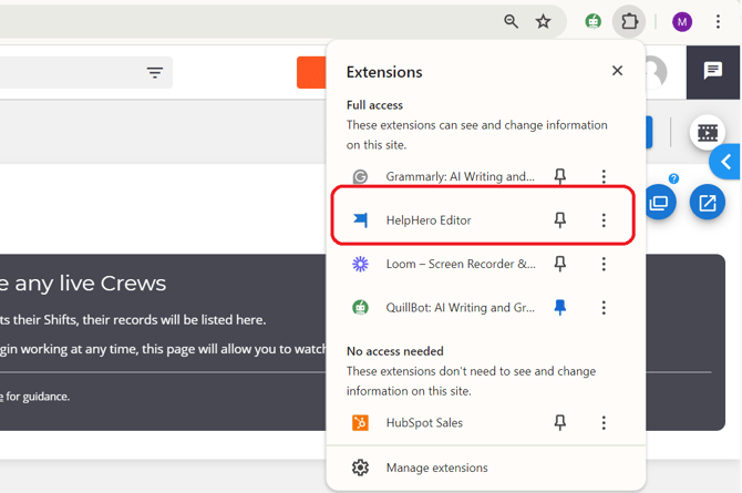
To get started, you will need to install the Chrome extension, which allows you to create/edit and preview tours without making any changes to the Yeti web app. Go to any page on the web app itself. Click the HelpHero icon to bring up the HelpHero extension settings popup (circled red). The HelpHero Editor should appear on the left-hand side of your website. You can now start creating and previewing tours.
What are the Self-Service options?
Self-Service options refers to the feature that enables you to provide customers with resources and tools to find solutions to their problems independently, without needing to contact customer support directly. This feature typically includes hotspots, tutorials, guides, and other relevant information.
Hotspots 
Hotspots are the little blue question mark icons you see throughout Yeti. By clicking on them the user can access text that explains an element. All hotspots are currently ‘On-Click’ which means the user will have to click a question mark for the text to appear.
To Create a Hotspot:
- Open up the Help Hero editor on the Yeti Web app
- Click Hotspot on the Editors menu
- Go to the page you want the hotspot on
- Click the white plus button in the top right of the editor
- Give it a name
- Then select element
- Click the area (on the yeti page) where you want the hotspot to be.
- Click next
- Select a label
- The condition can be set here if required
- Select Click Hotspot icon
- Head over to style (next tab)
- For Icon select Qestion
- For Animation select none
- Click save
- Click the edit button which will appear near the new hotspot
- Enter in title and Body
To Edit an Existing One:
- Open up the editor
- Click on hotspot
- Click on an already existing hotspot on the editor
- Make your changes
- Click save
Elements
Help Hero breaks down the web app UX into building blocks called Elements. An element refers to the area or component of the web app page used to add hotspots or guides to.
Label
Labels are used for organizing things. Click on the hotspot you wish to assign a label to in the editor. Under the name, you’ll find a field called labels. Enter in text, press enter, and a new label will be created and assigned. You can create up to 40 labels. Labels are color coded to make it easy to identify and organize your HelpHero content.
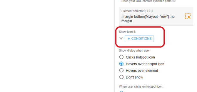
Conditions
You can specify show conditions on your hotspots to ensure they are seen by the right users. Conditions that apply to tours and checklists like user properties, user events, device type, etc can also be used in hotspots.
Highlights
You can highlight elements on a page. This can be used to explain and draw attention to the different parts of your UI. Highlight elements and prompt users to click on the element rather than having a next button to go to the next step.
Styling
When creating a hotspot, you can customize the look by clicking the Style button in the navbar. You will be given the option to set the icon, colour, and overall style. Current style setting:

Icon Alignment: top right
Icon y offset: -3
Icon x offset: -6
Icon: Question
Icon size: 12
Icon color: #2196f3
Icon backdrop color: Default
Dialog preferred width: 350
Dialog preferred side: Bottom
Z-index: 2
Staging
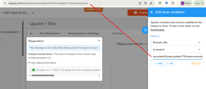
If you want the hotspot to only be presented on staging then you will need to add a condition to the hotspot.
Step 1 Select the (+ condition) button.
Step 2. Select the dropdown menu and select ‘Browser URL’.

Step 3 Make sure the url you enter is the correct staging page that the hotspot is to be presented on.